Analytics components are used to present a graphical representation of data. They are used for the analysis and visualization of data.
All analytic components have similar properties and only the representation format varies. Their default colors can be modified to suit user requirements. There is no maximum limit for the number of colors that can be added. The colors can also be modified using custom CSS.
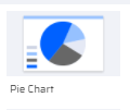
1) PIE CHART
The pie chart provides data represented in the form of a pie. They provide analysis of data in the form of percentages. By default, the Pie Chart offers 4 partitions with 5 color options. Multiple colors can be added in the properties section.
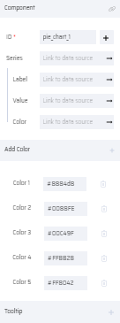
The values can be mapped into the pie chart using the series property where each value is represented using a label and color.
PROPERTIES:
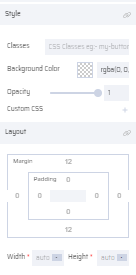
Pie Chart: ID(Add Variable), Series - Label, Value, Color (Link To Data Source), Add Color (5 colors by default), Tooltip, Style, Layout
| Thumbnail | On Canvas | Properties |
|---|---|---|
 |  |   |
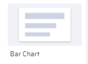
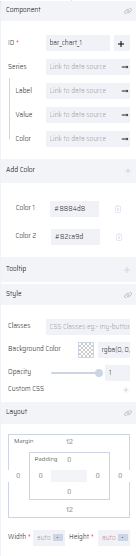
2) BAR CHART
The bar chart represents data in the form of vertical bar columns. By default, the Bar Chart offers a comparison of two entities with two colors.
The values can be mapped into the bar chart using the series property where each value is represented using a label and color.
PROPERTIES:
Bar Chart: ID(Add Variable), Series - Label, Value, Color (Link To Data Source), Add Color (2 colors by default), Tooltip, Style, Layout
| Thumbnail | On Canvas | Properties |
|---|---|---|
 |  |  |
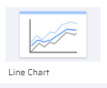
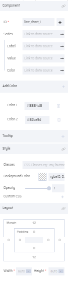
3) LINE CHART
Line charts represent data in the form of lines and curves. By default, the Line Chart offers a comparison of multiple entities with two colors.
The values can be mapped into the line chart using the series property where each value is represented using a label and color.
PROPERTIES:
Line Chart: ID(Add Variable), Add Color (2 colors by default), Series - Label, Value, Color (Link To Data Source), Tooltip, Style, Layout
| Line Chart Thumbnail | Line Chart On Canvas | Line Chart Properties |
|---|---|---|
 |  |  |
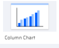
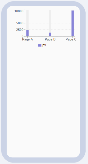
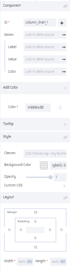
4) COLUMN CHART
In a column chart, the data is represented in the form of vertical columns. By default, the Column Chart offers a comparison of multiple entities with a single color.
The values can be mapped into the column chart using the series property where each value is represented using a label and color.
PROPERTIES:
Column Chart: ID(Add Variable), Series - Label, Value, Color (Link To Data Source), Add Color (1 color by default), Tooltip, Style, Layout
| Column Chart Thumbnail | Column Chart On Canvas | Column Chart Properties |
|---|---|---|
 |  |  |
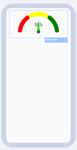
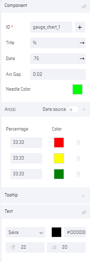
5) GAUGE CHART
In a Gauge chart, the data is represented in an axis and pointed through a needle like a speedometer dial. Such charts are used in dashboard reports to show key business indicators.
The values can be mapped into the gauge chart using the Arc(s) property where each value is represented using Percentage and Color.
Alternatively, the Data source can be selected, and values are linked through a Series array.
The Arc Gap property denotes the gap between the color segments and Needle Color can be changed as required.
PROPERTIES:
Gauge Chart: ID, Title, Data, Arc Gap, Needle Color, {Arc(s)- Link to Data Source}, Tooltip, Text, Style, Layout
| Gauge Chart Thumbnail | Gauge Chart on Canvas | Gauge Chart Properties |
|---|---|---|
 |  |   |