How to Edit App Designer Components?
Each component in the App designer can be independently edited. On selecting any component, 3 vertical lines appear with an arrow.
The arrow points to the parent component in the specified hierarchy:
For example, in the List view Property, the arrow redirects to the parent component from multiple child components.

Clicking The 3 vertical lines (ellipses) provides the following options:
- Copy - Helps to copy the component to Clipboard
- Paste - Helps to paste the component from Clipboard
- Delete - Helps to Delete the selected component
- Add Behavior - Helps to Add Behavior to the selected component.
The behavior for each screen and each component in a screen is individually compiled in the behavior section. This is done in the App Behavior section.
App Designer Settings
The following actions can be carried out in the App Designer page.
Canvas Options:
The canvas area offers the following options:
- AutoSave
- Undo/Redo
- Re-arrange Components
- Copy
- Edit Text on double click (Paragraph, Header, Footer, etc.)
- Delete
Component Options:
- Users should be able to drag and drop anywhere in the canvas.
- Users should be able to edit the text in the canvas area and also in the properties section.
- Elements drag and dropped should adhere to the grid system.
- On Re-arranging Components, the AutoSave will trigger an API to save the page.
- Copy creates a copy of that component as a sibling to the same page and it will trigger an AutoSave.
There is also a search bar in the component section that helps developers search for required components.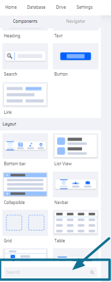
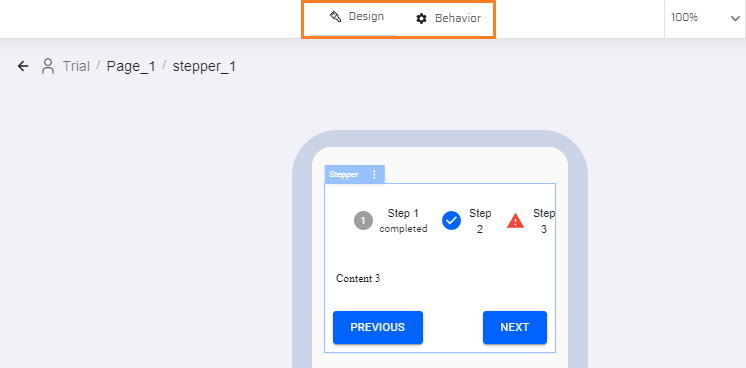
On the top of the App designer, there is a Design and Behavior tab. The design tab helps design the screen while the behavior tab helps users decide how each component should function.
Screen View Options:
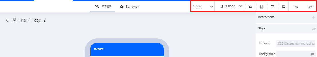
- There is an option to view the screen from different devices (iPhone/iPad, Android (Phone & Tablet), Windows (Tablet) and for different operating systems (iOS, Android, Windows).
- The screens can be viewed in landscape mode, portrait mode, and browser mode.
- There is an undo/redo option. The Undo/Redo options work for the last 10 actions. For every undo/redo, the autosave will be triggered.
- There is a zoom option available with a range between 50% to 150%.
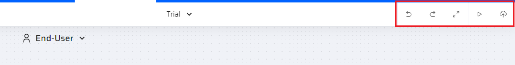
Screen Preview and Publish Options
The user can see the following options in the APM screen.
- Undo
- Redo
- Fullscreen
- Preview
- Publish
Properties Options:
- Properties are autosaved.
- All Properties of Parent and Child components are reflected in the UI immediately.