Q: I want to display a list of locations in a table format with some columns being editable, What are the App designer components that are suitable to design for this requirement?
A:It is important to decide whether your application is a mobile application or a web application, since the screen size/resolution also decides which component fits best to display a list of items with editable columns.
For Apps accessed through Tablets, Desktops(Web Apps)
The recommended component is the Datagrid. The following steps help you to design the UI to display a list of locations using the datagrid component with one column being editable for user entry.
Steps:
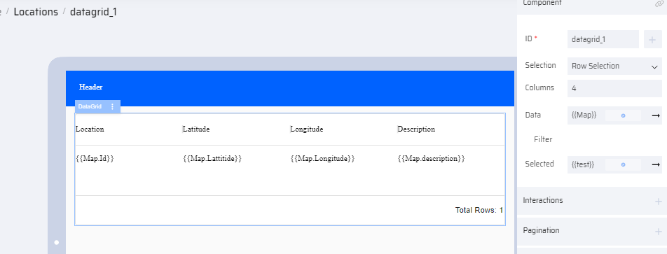
- In a Page component, drag and drop a datagrid component.
- Modify the Datagrid properties as below:
- Selection - Row Selection
- Columns - 4
- Data - Link it to a variable(Map). This variable is created under "Add Variable" section with the required columns.
- Selected - Link it to a variable(test). This variable holds the user entered data.
- Click the Header cell of each column and add the Title. Modify the properties as below:
- Editable - Disable
- Data - Link it to Map.Id
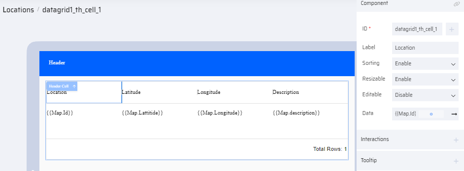
- Follow the above properties for the non-editable columns.
- Click the header cell(column) that must be editable and add the following properties:
- Editable - Enable
- Data - Link it to Map.Description
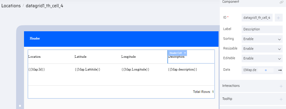
- Add a BOS to pass the Database table to the Map variable.
.png)
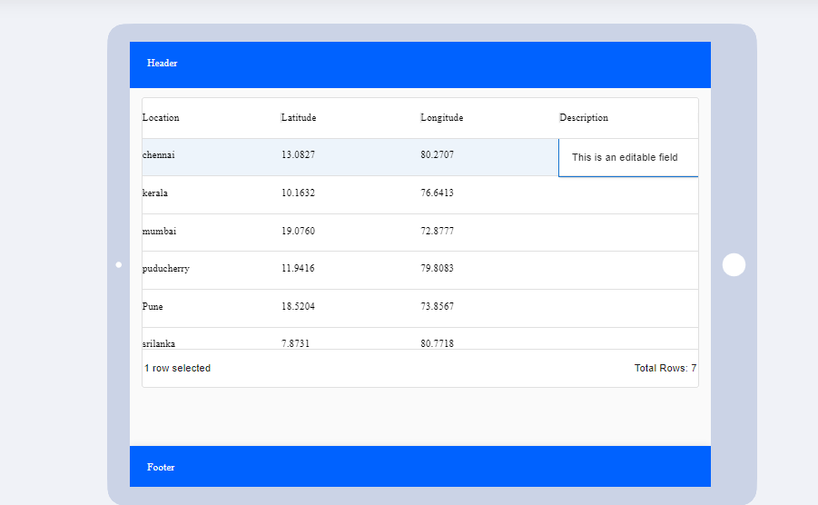
- Preview the App to check the layout. Modify the design if required.
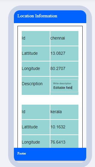
For Apps accessed through Mobile Devices
The ListView component is more appropriate, and it can be customized to have editable columns. The following steps help you to design the UI to display a list of locations using the ListView component with one column being editable for user entry.
Steps:
- Drag and drop the ListView component on your page
- Based on the required UI design, delete the extra child components.
- Map the main ListView component to a variable(Map).
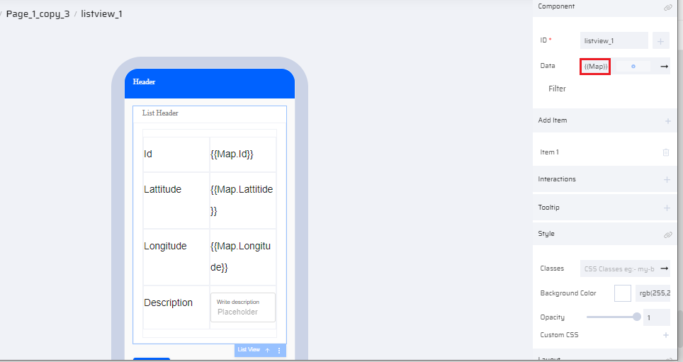
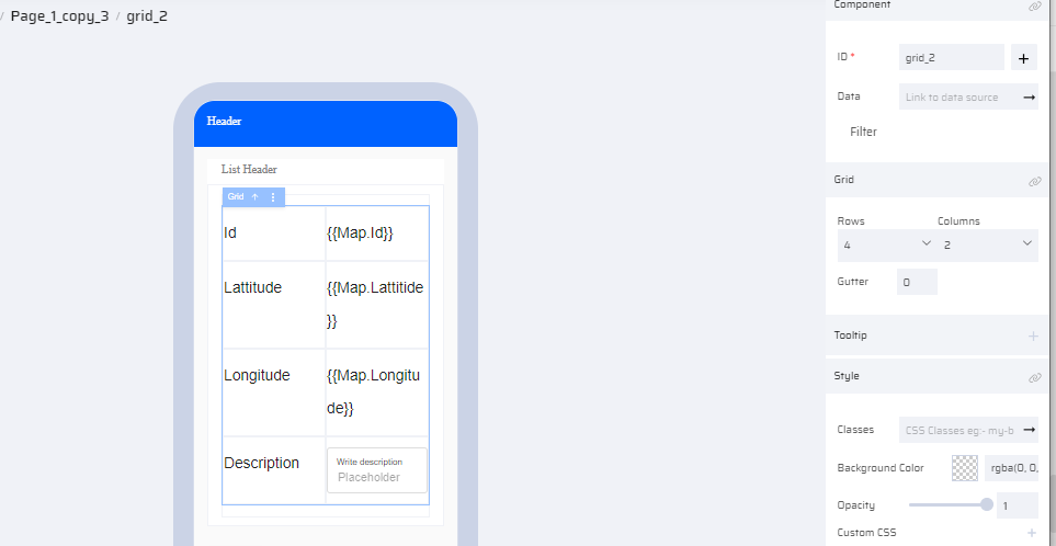
- Modify the grid cell within the ListView to have 4 rows and 2 columns.
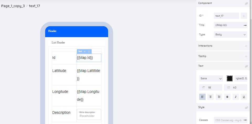
- Link the columns of the Map variable to the textcomponent as shown in the image:
- To make one column editable, place a TextInput component within the cell.
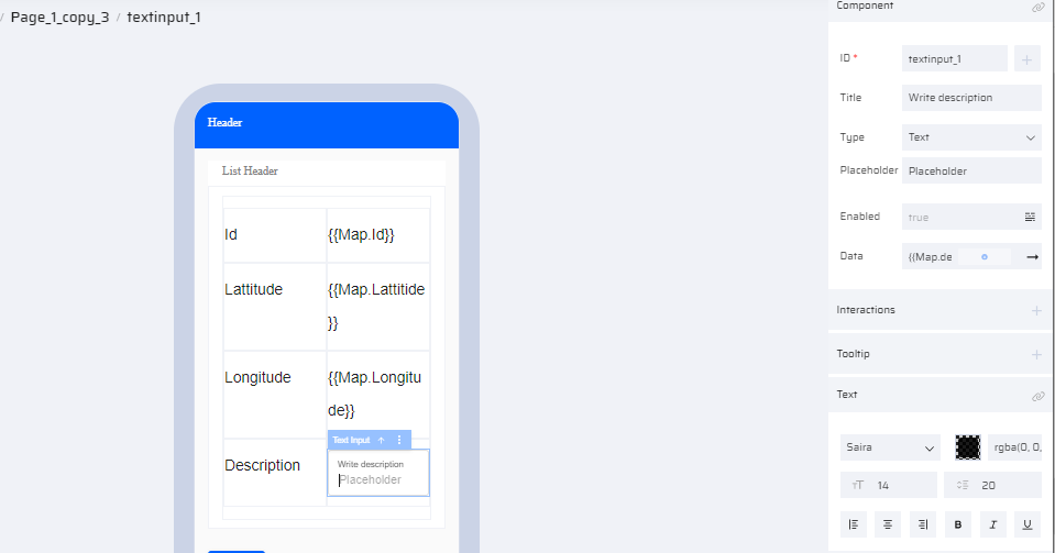
- Link the Map.Description variable to the TextInput component.
- To add background color and border(optional step), add the following custom class to each grid cell:
border: 1px solid white;
background-color: #96D4D4;
- Preview the app and modify the design if required.
Points to Remember While Designing Your Application:
Default Functionality of a Component
Each component comes with a default set of functionalities. It's essential to choose the right component to design your application. For instance, when dealing with form validations such as enabling or disabling fields based on specific conditions, components like text input, text area, or dialog boxes are more suitable. Avoid using the datagrid component for form validations, as it requires additional customization with app behaviors.
Careful Assessment of Requirements
Before starting the design process, thoroughly assess the project requirements. Consider potential future enhancements as well. This proactive approach helps in avoiding the use of specific components that might require extensive customization for future needs. Using the right component from the beginning can prevent unnecessary code complexity.