Field components are used when a user is required to input data into the screen in fields provided. The App Designer has several field components where users can select or provide data as input.
1) SELECT
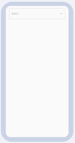
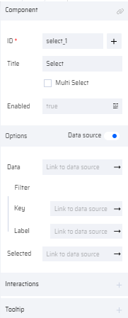
The Select component provides a dropdown list where the user can select from the available options. If the Multiselect checkbox is selected, the user can select more than one option.
By default, the component provides two options. More options can be added based on the user requirements in the Options column of the properties section. If the data input is static, the options are added one by one. If the input needs to be dynamic and requires to be populated during runtime, then the Data Source option is selected and variables (Key, Label, and Selected values) are mapped.
PROPERTIES:
Select: ID, Title, MultiSelect, Selected, Enabled, Interactions, Tooltip, Text, Style, Layout
Options (with or without data source).
With data source: Data (Link to Data Source), Filter
Data -Key (Link to Data Source), Label (Link to Data Source), Selected (Link to Data Source).
The Selected property, takes the user selected values to the mapped variable. If the Multiselect checkbox is enabled, the selected property takes in the list of values in a comma separated format.
| Select Thumbnail | Select on Canvas | Select Properties |
|---|---|---|
 |  |   |
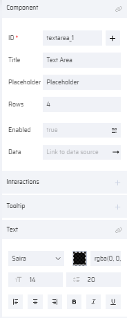
2) TEXT AREA
Text Area provides an option for the user to input text inside a text box. The Rows property represents the number of rows of text visible to the user. This component is usually used when the user has to enter a few lines of text. If required, the maximum number of lines that can be entered by a user can be set by adding a behavior to the component.
PROPERTIES:
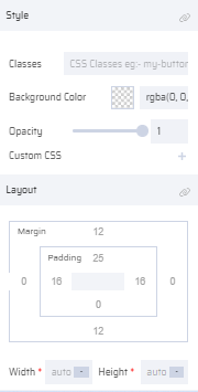
Text Area: ID ( Add Variable ), Title, Placeholder, Rows, Enabled, Data (Link to Data Source), Interactions, Tooltip, Text, Style, Layout
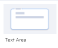
| Text Area Thumbnail | Text Area on Canvas | Text Area Properties |
|---|---|---|
 |  |   |
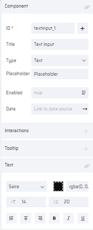
3) TEXT INPUT
The Text input component allows a user input. It can be used to input texts like a text, number, date, password, or an email address. The maximum number of input characters that can be entered by a user can be set by adding a behavior to the component.
PROPERTIES:
Text Input: ID ( Add Variable ), Title, Type (Text, NumberPad, Date, Time, Password, Email), Placeholder, Enabled, Data (Link to Data Source), Interactions, Tooltip, Text, Style, Layout
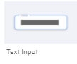
| Thumbnail | Text input on Canvas | Text input Properties |
|---|---|---|
 |  |   |
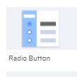
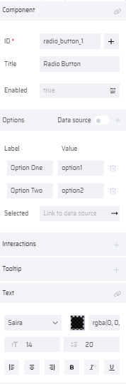
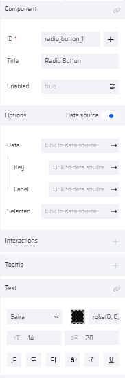
4) RADIO BUTTON
The Radio button component allows the user to select only value from a predefined set of options. By default, the Radio Button offers two Options to select. More options can be added in the properties section.
If the data input is static, the options are added one by one. If the input needs to be dynamic and requires to be populated during runtime, then the Data Source option is selected and variables (Key, Label, and Selected values) are mapped.
PROPERTIES:
Radio Button: ID ( Add Variable ), Title, Enabled, Selected, Interactions, Tooltip, Text, Style, Layout
Options (with/without data source).
With data source: Data (Link to Data Source), Data -Key(Link to Data Source), Label (Link to Data Source), Selected (Link to Data Source)
The Selected property, takes the user selected value to the mapped variable.
| Radio button Thumbnail | Radio button on Canvas | Radio button Properties(without Data Source) | Radio button Properties(with Data Source) |
|---|---|---|---|
 |  |   |   |
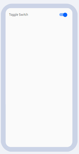
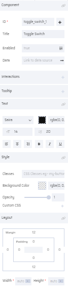
5) TOGGLE SWITCH
The Toggle switch is used to perform an ON/OFF (binary) operation. It helps to enable/disable features for a particular App.
PROPERTIES:
Toggle Switch: ID ( Add Variable ), Title, Enabled, Data (Link to Data Source), Interactions,
| Toggle Switch Thumbnail | Toggle Switch on Canvas | Toggle Switch Properties |
|---|---|---|
 |  |  |
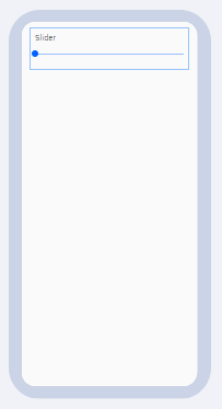
6) SLIDER
The Slider component helps to establish a threshold for a particular functionality. The number of steps by which a slider can move and the max/min values is set in the properties section.
PROPERTIES:
Slider: ID ( Add Variable ), Title, Step, Min/Max, Enabled, Data (Link To Data Source), Interactions, Tooltip, Text, Style, Layout
| Slider Thumbnail | Slider on Canvas | Slider Properties |
|---|---|---|
 |  |   |
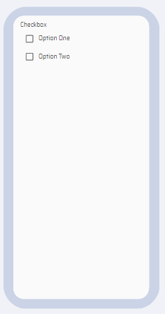
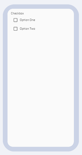
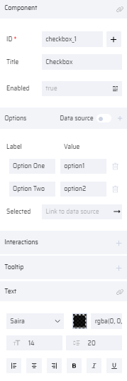
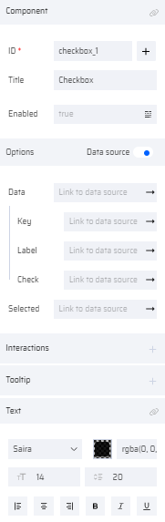
7) CHECKBOX
Checkbox provides options for users to select from multiple entries. Similar to the radio button component, two options are provided by default. More options can be added in the properties section.
If the data input is static, the options are added one by one. If the input needs to be dynamic and requires to be populated during runtime, then the Data Source option is selected and variables (Key, Label, Check, and Selected values) are mapped.
PROPERTIES:
Checkbox: ID ( Add Variable ), Title, Enabled, Selected, Interactions, Tooltip, Text, Style, Layout
Options (with/without data source),
With data source: Data (Link to Data Source), Data -Key(Link to Data Source), Label (Link to Data Source), Check (Link to Data Source).
The Selected property, takes the user selected values to the mapped variable. The selected key values are mapped to Selected variable in comma separated format.
| Checkbox Thumbnail | Checkbox on Canvas | Checkbox Properties (Without Data Source) | Checkbox Properties (With Data Source) |
|---|---|---|---|
 |  |   |  |
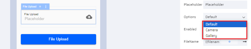
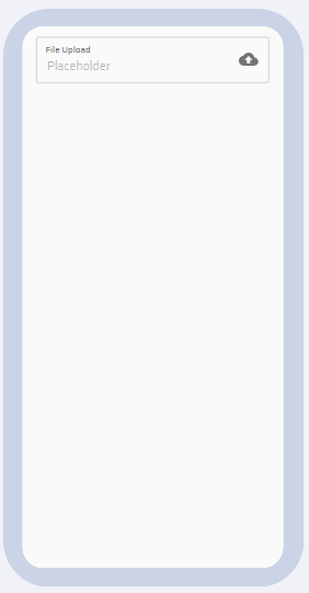
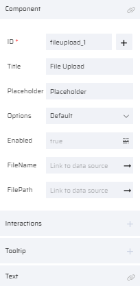
8) FILE UPLOAD
The File upload component provides a gateway to upload a file from a device to EdgeReady drive. The source file name and file path can be mapped to variables through FileName and FilePath fields in the properties section.
The allowed characters for filenames of the uploaded files are as follows:
- Alphanumeric characters: [0-9][A-Z][a-z]
- Special characters: '-', '_', '/', '.', and '\s')
The component consists of an Options property. Based on the selected value, the app user can upload a file in the following ways:
- Default: When the app user clicks file upload, a pop-up appears in the UI - to open the 'Camera' or to select file from 'Gallery'.
- Camera: When the app user clicks file upload, it redirects to the camera in the device without a prompt.
- Gallery: When the app user clicks file upload, it redirects to the gallery folder in the device without a prompt.
PROPERTIES:
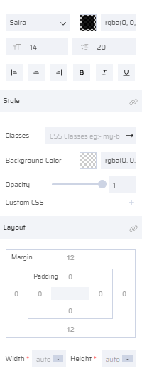
File Upload: ID ( Add Variable ), Title, Placeholder, Enabled, FileName (Link to Data Source), FilePath (Link to Data Source), Interactions, Tooltip, Text, Style, Layout
| File upload Thumbnail | File upload on Canvas | File upload Properties |
|---|---|---|
 |  |   |
9) IMAGE
The image component enables users to add images to the screen. On clicking the “Change Image” option or the Image on the canvas, the following popups appear to upload images.
Upload helps to upload new images.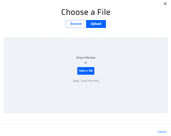 | The browse option helps to select images that are already pre-uploaded.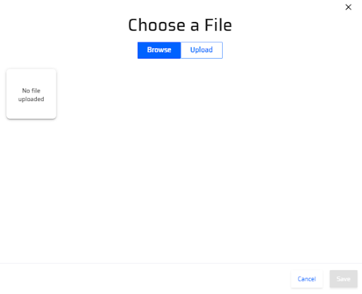 |
PROPERTIES:
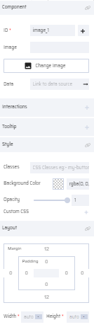
Image: ID ( Add Variable ), Image(Image Name), Change Image, Data (Link to Data Source), Interactions, Tooltip, Style, Layout
| Image Thumbnail | Image on Canvas | Image Properties |
|---|---|---|
 |  |  |
10) AUTO COMPLETE
This component displays a list of matching entries based on the user input text before the user completes typing. Apart from this feature, it works like the Select component. If the Multiselect checkbox is selected, the user can select more that one option. If InlineSearch is enabled, the user input values are searched from the table variable linked to the Data property and the matching entries are displayed.
PROPERTIES:
Auto Complete: ID ( Add Variable ),Title, Placeholder, MultiSelect, InlineSearch, Enabled, Interactions, Tooltip, Text, Style, Layout
Options (with or without data source).
With data source: Data (Link to Data Source), Filter
Data -Key(Link to Data Source), Label (Link to Data Source), Selected (Link to Data Source), Search Text (Link to Data Source).
The Selected property, takes the user selected values to the mapped variable. If the Multiselect checkbox is enabled, the selected property takes in the list of values in a comma separated format.
| Auto Complete Thumbnail | Auto Complete on Canvas | Auto Complete Properties |
|---|---|---|
 | 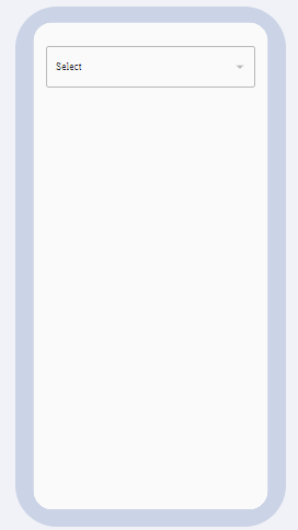 | 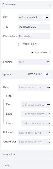  |
11)RICH TEXT EDITOR
The Rich Text Editor component enables the user to enter text and apply different formats/style using the available options in the editor. The user can map a variable to the data and save it to the database. The input data is stored as html code in the database.
The following formatting options are available in the rich text editor:
| Format Image | Format |
|---|---|
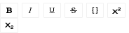 | Bold, Italic, Underline, Strikethrough, Monospace, Superscript, Subscript |
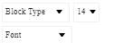 | Block Type(Headings(Normal, H1-H6, Blockquote, Code), Font Size, Font Type |
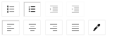 | Unordered, Ordered, Indent, Outdent Left, Center, Right, Justify, Color Picker |
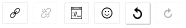 | Link, Unlink, Embedded, Emoji, Undo, Redo |
PROPERTIES:
Rich Text Editor: ID ( Add Variable ), Enabled, Data (Link to Data Source), Interactions, Tooltip, Text, Style, Layout
| Rich Text Editor Thumbnail | Rich Text Editor on Canvas | Rich Text Editor Properties |
|---|---|---|
 | 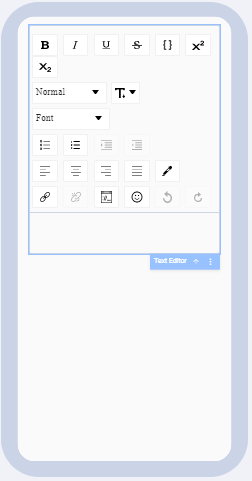 | 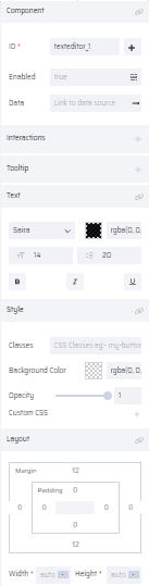 |