The Generic components comprises of the Topbar/Header, Footer, Heading, Text, Search, Button and Link. They are generic because they do not have any specific functionality and are used only for representing the data or redirecting the data to a different section or page. All generic components(except Topbar and Footer) do not have any child components inside them.
TOPBAR/HEADER
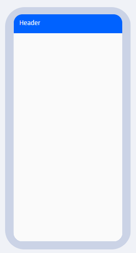
It is placed as a Page Header on the top of the page. It is used to represent the title of the page. On double-clicking the header text, the text properties can also be edited.
PROPERTIES:
The following properties can be edited:
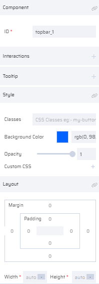
- For the Topbar: ID, Interactions, Tooltip, Style, Layout
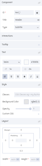
- For the Header Text: ID(Add Variable), Title, Type, Interactions, Tooltip, Text, Style, Layout
If multiple actions are required to be performed within the Topbar, it can be partitioned using the Grid component and other components can be included in the Header itself.
| Topbar Thumbnail | Topbar on Canvas | Topbar Properties | Topbar Text Properties |
|---|---|---|---|
 |  |  |  |
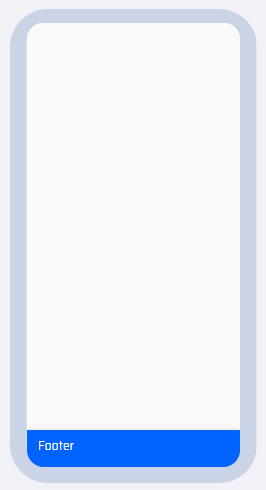
2. FOOTER
Once a Footer is dragged and dropped, it appears at the bottom of the page. Similar to the Header component, the footer text can be edited by double-clicking the text 'Footer'.
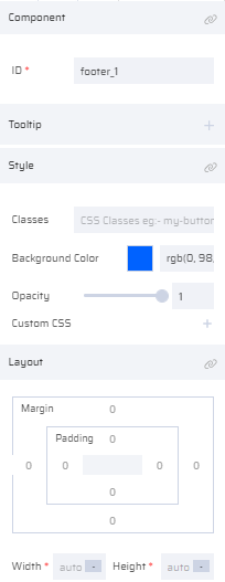
PROPERTIES:
The following properties can be edited:
- For the Footer: ID, Tooltip, Style, Layout
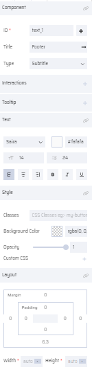
- For the Footer Text: ID(Add Variable), Title, Type(Body, Subtitle, Caption), Interactions, Tooltip, Text, Style, Layout
| Footer Thumbnail | Footer on Canvas | Footer Properties | Footer Text Properties |
|---|---|---|---|
 |  |  |  |
There can only be one Header and Footer per page. Multiple headers and footers cannot be added.
Other components like Bottom Bar cannot be added if a Footer is already present on the Page. If the Footer is expected to include multiple components, then it can be partitioned using the Grid component.
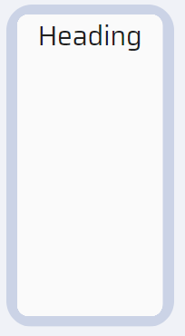
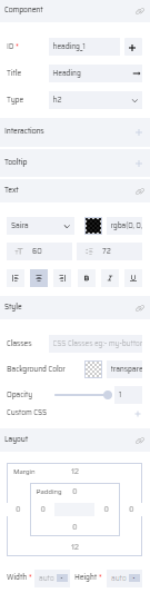
3. HEADING
It is used to provide a Title or Heading to a page in different levels. The heading property allows a maximum of 6 levels of headings. The user can click the heading component to edit the Heading text.
PROPERTIES:
Headings have the following properties:
- Heading: ID(Add Variable), Title, Type(h1, h2, h3, h4, h5, h6), Interactions, Tooltip, Text, Style, Layout
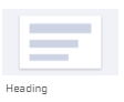
| Heading Thumbnail | Heading on Canvas | Heading Properties |
|---|---|---|
 |  |  |
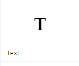
4. TEXT (LABEL)
This component provides a text space for the user to enter data when dragged and dropped into the canvas. It is used to assign a label to a particular component in the canvas. The text(label) value can be assigned dynamically by mapping a variable to its Title property. The Text component can be added within other components like the Grid, Table, etc.
PROPERTIES:
Label component has the following properties:
- Text (Label):ID(Add Variable), Title, Type (Body, Subtitle, Caption), Interactions, Tooltip, Text, Style, Layout
| Text Thumbnail | Text on Canvas | Text Properties |
|---|---|---|
 | 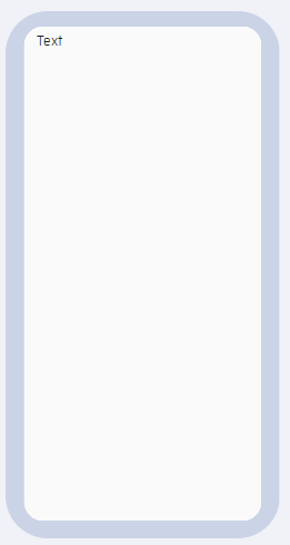 | 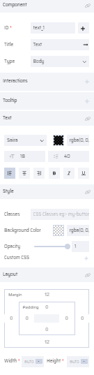 |
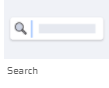
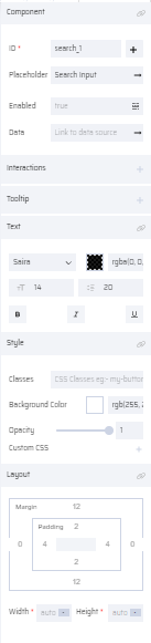
5. SEARCH
This component provides a search bar when it is dragged and dropped into the canvas area. It is used to search for a particular data within the App.
PROPERTIES:
The search bar properties are listed below. It has a Data Property that enables users to dynamically populate data through variables from the backend. The variables can be mapped to the corresponding search bar that can be available from the UI during runtime.
- Searchbar: ID(Add Variable), Placeholder (Text), Enabled, Data (Link To Data Source), Interactions, Tooltip, Text, Style, Layout
| Search Thumbnail | Search on Canvas | Search Properties |
|---|---|---|
 | 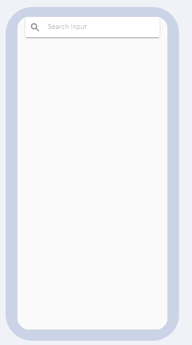 |  |
You can search only for specific data that is within the scope for which the App is designed for. The search bar cannot be used to perform any general search unless it is programmed in the backend for the same.
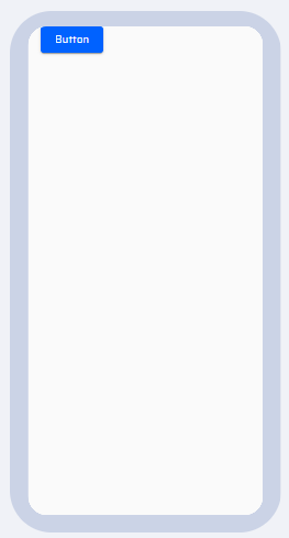
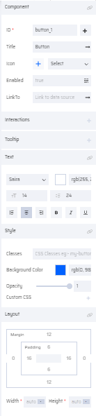
6. BUTTON
Buttons are used for redirecting a page or performing a specific action when it is clicked. Icons can be added to buttons depending upon their functionality.
The button component is a very dynamic component that can be added multiple times within a page as per requirement. It can also be added within other components. By default, the button appears on the top of the page when dragged and dropped. Its position can be changed within the page by dragging it to a specific point or through custom CSS in the Style property.
PROPERTIES:
Button: ID(Add Variable), Title, Icon picker, Position Select, Enabled, Link To (Link To Data Source), Interactions, Tooltip, Text, Style, Layout.
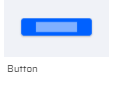
| Button Thumbnail | Button on Canvas | Button Properties |
|---|---|---|
 |  |  |
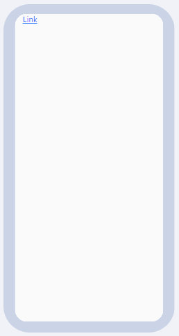
7. LINK
The Link component is used to redirect a page to another page, document or URL by specifying a particular link.
For files within the drive, the filepath is mapped to the Link component. External URLs can also be mapped to the Link component, but they have to be enabled during Container App generation.
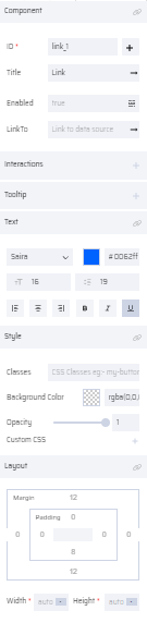
PROPERTIES:
Link: ID(Add Variable), Title, Enabled, Link To (Link To Data Source), Interactions, Tooltip, Text, Style, Layout
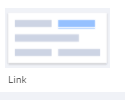
| Link Thumbnail | Link on Canvas | Link Properties |
|---|---|---|
 |  |  |
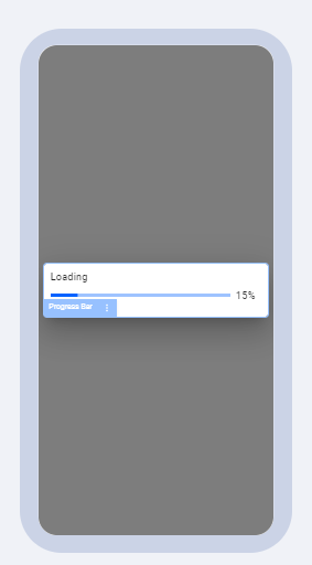
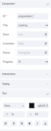
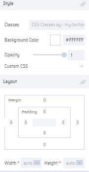
8. PROGRESS BAR
The Progress bar component is used to show the progress of an event happening in the background. For example: updating files or loading data. It has the following unique properties in addition to the other component properties:
Autoclose
- If set to 'True' the progress bar is closed automatically after the event completes
- If set to 'False' the progress bar does not autoclose
- Variable - Linked to a variable whose value (True/False) determines the autoclose action at runtime
Status
Denotes the status of the progress. Includes the following default statuses:
- 'inprogress' - displayed in blue
- 'failed' - displayed in red
- 'completed' - displayed in green
- Variable - custom status can be added here
Progress
Depicts the percentage(%) of the progress. Linked to a variable to display the percentage at various levels of progress.
PROPERTIES:
Progress Bar: ID, Title, Show, Autoclose, Status, Progress, Interactions, Tooltip, Text, Style, Layout
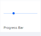
| Progress Bar Thumbnail | Progress Bar on Canvas | Progress Bar Properties |
|---|---|---|
 |  |   |
Refer to Glossary to view all the properties with their explanations in detail.