This page lists the properties of all App Designer components that are explained in the App Designer Components section. Each component will have:
- A set of unique properties under Component section specific to the action it performs,
- A set of common properties that are seen in all components within the App Designer. The common properties seen across all components are Interactions, Tooltip, Text, Style, and Layout.
The following image shows how the properties are arranged in the App designer.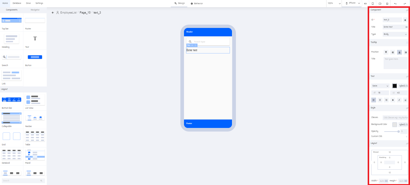
ADD COLOR
All the analytics components have an Add Color property. - The pie chart has five colors by default
- The line chart and bar chart has two colors by default
- The column chart consists of only one color property by default.
- Click + to add a new color.
There is no limit to the no of colors that can be added. | 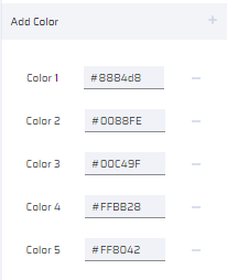 |
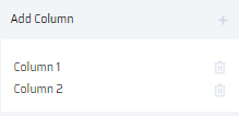
ADD COLUMNS
- This property is applicable to the Table component where additional columns can be added. By default, a table consists of two columns.
- Click + to add N no of columns.
|  |
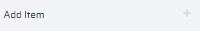
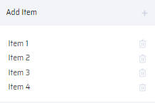
ADD ITEM
- The Add Item property is seen in the Bottom bar, List View, Navbar, Tab, Stepper and Panel components.
- It helps in adding extra bottom bar items, tabs, list items, steps to the existing component.
- Click + to add N no of items.
- For the Collapsible component, there is an Add Section property that is similar to Add Item property.
|   Collapsible Collapsible 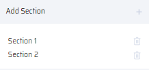 |
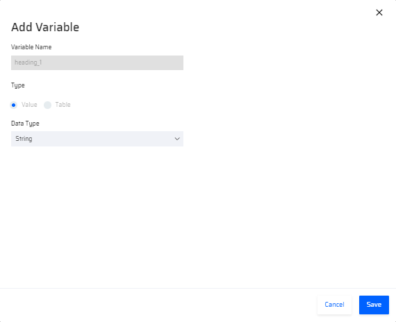
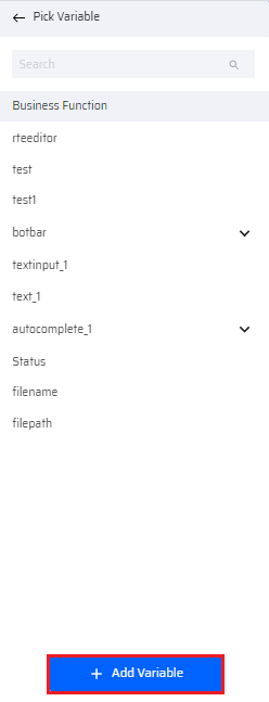
ADD VARIABLE
- Click the + icon to add a variable.
|  |
- In 'Add Variable' window, the variable can be defined as a value or table.
- For Value: Name and Data type are given.
- For Table: Name and Key values can be added along with their data type.
- Once saved, the variable is associated to the component ID and is automatically mapped in the Data property field.
- During runtime, the component data is dynamically mapped using the added variable.
|  |
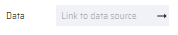
DATA
- The Data property is a primary connection between the UI and the database or between different UI components. It has two primary tasks:
- It helps to fetch the variables from database tables, business logic or EdgeReady drive and makes them accessible to the UI where the data is displayed.
- For input components, the Data property saves the user input values to the mapped variable.
- The Business function variables and workitem variables can be mapped through the Data property.
- The Header, Footer, and Panel do not require any Data Source.
| Data Source types for the App Designer Components | Data Property images |
|---|
- The Data property is present for several App designer components. It has a mapping arrow to map the variables.
- Once the arrow is clicked, the variables are mapped from the list or a new variable can be created and mapped by clicking 'Add Variable'.
Note When you map variables through Data, the + icon next to ID is disabled. Hence mapping can be done through Data or by clicking the + icon (next to ID) but not both.
| 
 |
Data in Generic ComponentsIn a search bar component, the text input by the user during run time is taken to the mapped variable(in this case, search_1), that can also be retrieved in the App behavior and Integration Builder. | 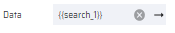 |
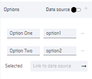
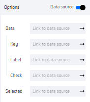
Data in Field ComponentsFor components such as Select, Radiobutton, Checkbox, Autocomplete, you can select ON/ OFF for the Data Source in the Options column of the properties section. - If the data input is static (OFF), the options are added one by one.
- If the input needs to be dynamic and requires to be populated during runtime, then the Data Source option is selected(ON) and variables are mapped.
- In the data source option, the following values are provided:
- Key - Is the reference number or ID that is given for a particular input. The Key will not be visible in the UI but is critical to fetch the required value for a particular request.
- Label - Label is the required data that is mapped using a particular Key. Unlike the Key, the Label value is visible in the UI.
- The Checkbox additionally consists of Check(Key) for mapping data. This helps to map a checked data into the mapped variable.
- The selected option helps to map the values selected by the user. The selected option is present for both static and dynamic mapping.
Note For the Select and Radio button, the Check(Key) is unavailable.
| For Checkbox (Data Source: ON/OFF)
 For Select/Radio Buttons: (data source:ON/OFF) For Select/Radio Buttons: (data source:ON/OFF)
|
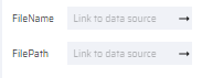
- For the File Upload component, the FileName and FilePath are parsed into the mapped variables.
- The FilePath variable can be used as a source inside the Upload block in Integration Builder.
|  |
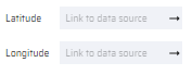
Data in Advanced Components- For the GPS component, the Data Source reads the current device location into the mapped Latitude and Longitude variables.
| For GPS:
 |
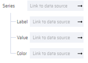
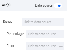
Data in Analytic Components- The analytics components have data in the form of a Series Array with Label, Value, and Color properties.
- The Label holds the content, the Value holds the numerical information, and Color holds the information of identity.
- For Gauge chart(alone), the Percentage holds decimal information, and Color holds the information of identity(generic color names or hex values can be entered).
| 
For Gauge Chart:
 |
EDITABLE
| This property is specific to the Datagrid. It is a dropdown list that enables/disables a user to edit data in specific columns in a datagrid. | 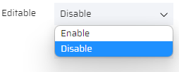 |
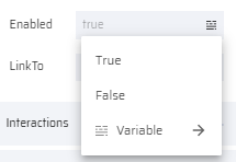
ENABLED
The Enabled property enables the app component during runtime. It has the following values:- True: Enables the component
- False: Disables the component
- Variable: Linked to a Business Function variable with either ‘True’ or ‘False’ as values. A change in the variable value triggers the enabling or disabling of the component respectively
|  |
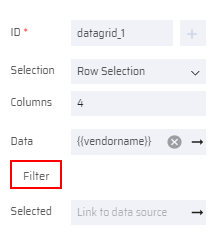
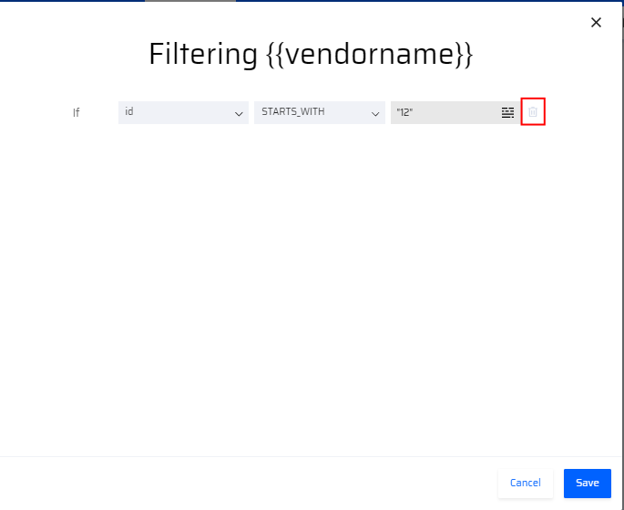
FILTER
This property filters the data stored in the mapped table variable(Data), before it is loaded in the component.
The following components have the Filter property:- List View
- Grid
- Table
- Datagrid
- Select
- AutoComplete
All other components with the above as child components would have the filter property.
To add a Filter, do the following:- Select a table variable in Data.
- Click Filter to enter the filter condition. A popup window appears.
- The user selects the filter condition(EQUAL, BETWEEN, STARTS_WITH) and clicks Save.
To clear filter conditions, click the Deleteicon.Note The columns to be filtered should be declared as a primary key column or indexed. (For more information refer Variables section.)
| 
 |
GRID
This property is applicable to grids. The number of rows and columns per grid can be determined. Gutter determines the pixel gaps between different grid cells. | 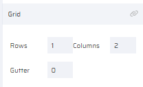 |
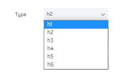
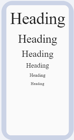
HEADING TYPE
- This property is applicable to the Heading component where heading levels (h1 - h6) can be assigned.
- The heading levels define the size of the Heading text in the component.
| 
Heading - Levels (h1-h6)
 |
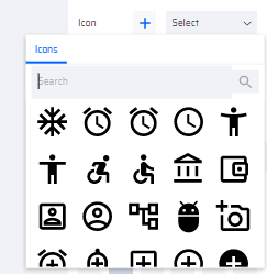
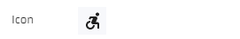
ICON PICKER WITH POSITION SELECT
- The icon picker is available for components like Button, Bottom bar item, Navbar, Tab, and Stepper item where an Icon can be selected.
- Click the + button to select from the list of icons.
- This property is also available for components that has buttons as child components.
- You can select the icon position from the drop down list.
Note For the Stepper component, an icon can be selected only when you choose "Custom Icon" in Stepper Type. Also, the icon position is not available for the Stepper component.
|  After Icon selection: After Icon selection:
 For Stepper Item: For Stepper Item:
 |
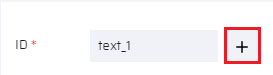
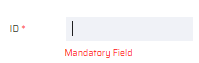
ID
- The ID is mandatory for every component( both Parent & Child components) in the App Designer.
- It is a property meant for identifying and representing a particular component within the App Designer.
|
 |
IMAGE
- This Image component helps users to upload a new image, or browse from an existing image and add it to the App designer.
- The filename of the uploaded image is displayed in the Image field.
|
.png) |
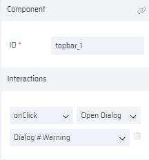
INTERACTIONS
This property enables the users to set the following actions based on the corresponding events available for a component:
- Navigate to a System Control (Go Back, Logout), Screens, Services(BOS) or any other component(Case, Condition, or DMN) created by the user
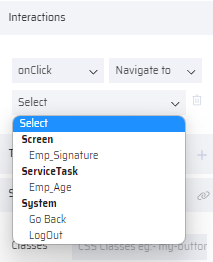
- Open or Close a Dialog box
 The list of events can vary for each component. The different types of events available for the App Designer components can be classified as following:
| Components | Event | Image |
|---|
| Page | OnPageShow OnSwipeLeft OnSwipeRight | 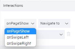 |
Topbar, Heading, Text, Button, Link, Progress Bar, BottomBar Item, Collapsible-Section, Content, Navbar Item, Table, Dialog Box, Tab and Image
| On Click | 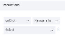 |
| Search, Text Area, Text Input, Rich Text Editor,Phone Call | OnChange OnKeyUp OnKeyDown | 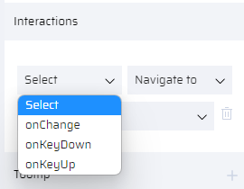 |
| Radiobutton, Toggle Switch, Slider, Checkbox, File Upload, Address Book, Barcode Scanner and GPS | OnChange | 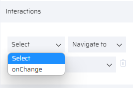 |
| ListView and ListViewItem, Grid and Gridcell | OnClick OnSwipeLeft OnSwipeRight | 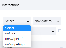 |
| AutoComplete | OnChange OnKeyUp OnKeyDown OnClick | 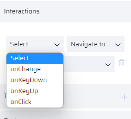 |
| DataGrid | OnSort InFilter OnCellEdit OnRowSelect OnRowDeSelect | 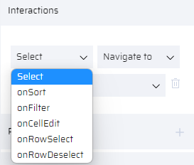 |
| DataGrid Row Cell | OnClick OnCellEditingStart OnCellEditingEnd | 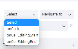 |
- Click the Delete icon to delete the interaction.
LABEL
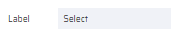
- The Label property assigns a label text to the component.
- It is available in the Bottom bar, Select, and Stepper, and Stepper button components. For the bottom bar, Stepper and Stepper button, the label can be assigned a dynamic value by mapping it to a variable.
|  |
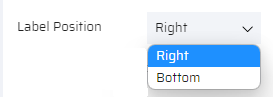
- For the Stepper component, additionally the Label Position can be selected. It is a dropdown list with two options.
|
 |
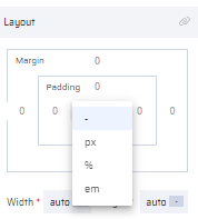
LAYOUT
- This property is used to position the component on the page.
- Margin helps determine pixel gaps between two different components. (By default, 24 pixel gaps are provided in between components)
- Padding is done to create pixel gaps between parent and child components.
- Width and height can be adjusted to px, %, or em values by clicking the respective dropdown lists.
- The default option is auto(-).
| 
|
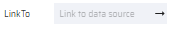
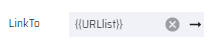
LINKTO
- LinkTo property helps the user link the component to variables.
- The variables holds Edgeready drive links or url's of external servers.
- It takes a string or table variable as input.
- LinkTo property is seen for all Button type components and Link component.
| 
 |
MULTISELECT
- The Multiselect checkbox is a property seen in the Select and Autocomplete components.
- When the user selects the checkbox, it enables them to select multiple values from the Select and Autocomplete drop down lists in the UI.
- The Selected property of the corresponding components takes in the list of values in a comma separated format.
| 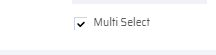 |
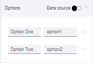
OPTIONS
- This property is specific to Select, Radio Button, Check Box, and Autocomplete components where users can choose from a list of options.
- Click + to add more Options.
- Options can be added only when Data source is disabled.
|  |
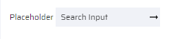
PLACEHOLDER (TEXT)
- It is similar to the Title property where a text is visible inside the component. This text is visible until the user enters their own text.
- For example, in a search bar, “Search Input” is displayed by default until the user clicks to enter their text.
|  |
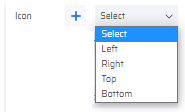
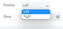
POSITION
- The Position property is seen only in the Panel component.
- You can place the Panel component on the Left/Right of the page using this property.
|  |
RESIZABLE
| This property is specific to the Datagrid. It is a dropdown list that enables/disables the user to resize a column during runtime. | 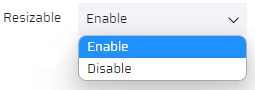 |
ROWS
This property is applicable to the 'Text Area' component to determines the number of lines of text displayed in the UI. | 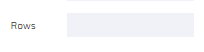 |
SELECTED
The Selected property maps the user-selected rows of the table(mapped to Data property) to a variable. It helps a user to access specific rows for data manipulation instead of writing code to retrieve particular data from large datasets.
The Selected property is present in the following components:- DataGrid
- Stepper
- Select
- Radio Button
- Checkbox
For more information on how Selected works, refer the How To's section. | 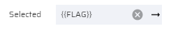 |
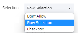
SELECTION
- This property is specific to the Datagrid. It is a dropdown list that enables or disables a user from selecting specific rows.
- To enable selection, a row selection and a checkbox option is currently available.
|  |
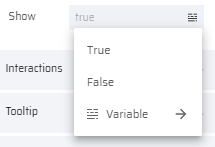
SHOW
- Allows the user to show or hide a component in the app screen. It has the following values:
- True- When the page loads the component is shown
- False - The component is not shown
- Variable - Linked to a Business Function variable with either ‘True’ or ‘False’ as values. Based on the variable value the component is shown or hidden in the UI
|  |
SHOW GLOBAL MENU
This property is visible to the user when Global Menu is enabled for a business function.
It enables or disables the Global menu for individual page components. | 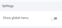 |
SIZING
For the Grid component, the width of each grid cell is determined by the sizing property. | 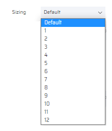 |
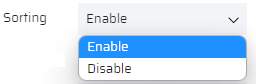
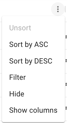
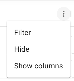
SORTING
- This property is specific to the Datagrid. It is a dropdown list that enables/disables the user to sort data in individual columns during runtime.
- If Sorting is enabled, the end user can view the following sorting criteria - Sort by ASC, Sort by DESC and Unsort.
- If Sorting is disabled, the end user can view only the Filter, Hide, and Show Columns options.
|  Sorting - Enable Sorting - Enable
 Sorting - Disable Sorting - Disable
 |
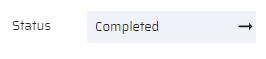
STATUS
- It is seen in the Stepper component. The values can be mapped to a variable.
- The status denotes the condition of the current page that the user just submitted.
- Currently, the status variable can hold only two values - 'Completed' and 'Error'. During runtime, based on the status,
- For Custom Icon, the step icon for each step are color coded to green or red respectively.
- For a numbered stepper, a blue tick or a red exclamation respectively.
|  |
STEPPER TYPE
This property is seen in the Stepper component. It is a dropdown list that specifies whether each step is Numbered or a Custom Icon can be added. | 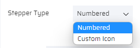 |
STEPS with MIN/MAX VALUES
Available for the Slider component. The number of steps and range of values are specified. | 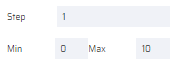 |
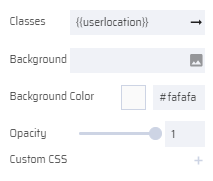
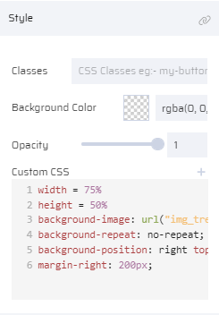
STYLE
- The component formatting can be modified using the Style property.
- Classes
- By assigning an inline class, the user can change the style properties of a set of components belonging to the same class in the App behavior.
- Additionally, a CSS class (imported from Library/Assets) can be applied by including the class name in this field.
- To add more than one class, include a space between the class names.
- Click the right arrow to assign a class through a variable
- Background Color can be determined by the user.
- Opacity can be determined by the user.
- Custom CSS can be written to position/format the components on the page.
|  Custom CSS Example: If a component, say “button”, needs to be near the right margin of the page, then custom CSS float:right; can be written to place it at the right. The custom CSS can be written as ordinary CSS code instead of JSON input. In the below example, the custom CSS is written as: - width = 75%
- height = 50%
- background-image: url("img_tree.png");
- background-repeat: no-repeat;
- background-position: right top;
- margin-right: 200px;
|
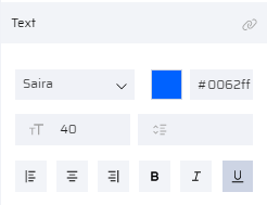
TEXT
- Any text displayed on the UI for a component can be formatted using the Text property.
- The Font type, color, size, line spacing, alignment, and BIU properties can be changed accordingly.
|  |
TEXT INPUT TYPE
This property is applicable to the field component - 'Text Input' where the user can choose the type of input for the component. | 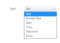 |
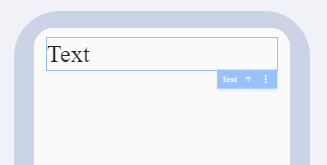
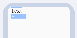
TEXT TYPE
- This is a property that is applied to the Title position in all text components (Heading, Text, List Text, Table Text, DataGrid text, Panel Text, Tab Text, and Stepper Text)
- The title text can be either placed as Body text, Subtitle, or a Caption.
- The Type property modifies the positioning of the Text title in the component.
For example: Body or Subtitle options positions the text title in the center of the text component. Caption positions the text title more like a heading. | 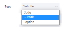
Type - Body
 Type - Caption Type - Caption
|
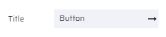
TITLE
- Every component is given a Title. The text given in the title, is how it appears on the UI.
- When the user clicks the arrow, the title property displays a list of variables that can be assigned to the text .
|  |
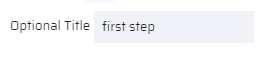
For the Stepper Item component, an Optional Title property is seen. It is similar to a subtitle that appears below the main title in the UI.
|  |
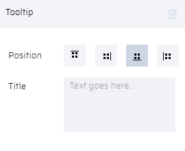
TOOLTIP
- Tooltip displays a message when you hover the cursor over the component.
- You can select the Position (Up, Right, Down, Left) for the text by choosing one of the options displayed.
|  |