Layout components define the layout of the screen. They decide how each component is arranged in the UI. Each layout component consists of a parent component with multiple child components placed inside them. For example, a Button can be placed inside a Grid, a Grid can be placed inside the List View, and so on.
The child components, in addition to parent components also have unique properties that can be individually edited.
The layout components are listed below:
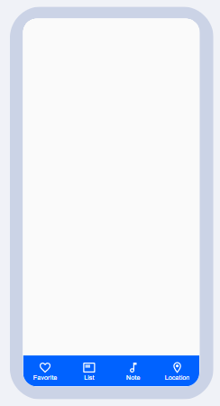
1) BOTTOM BAR
A bottom bar is similar to a footer component. It has 4 buttons as child components by default. The bottom bar items (buttons) can be added and removed as per requirements. All properties that are relevant to the Button component (Icon picker, Data, etc.) apply to the Bottom bar items.
PROPERTIES:
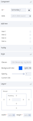
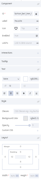
The bottom bar properties are listed below. The bottom bar and bottom bar items properties can be modified individually. The Add Item property in the bottom bar helps the user to add/remove multiple bottom bar items. Each item can be assigned a separate icon in the icon picker with appropriate positioning. The bottom bar item consists of a label property that can be mapped to a variable to populate the text of the bottom bar item.
Bottom Bar: ID ( Add Variable ), Data (Link to Data Source), Add Item, Tooltip, Style, Layout .
Bottom Bar Item: ID ( Add Variable ), Label, Icon picker, Position Select (Left, Right, Top, Bottom), Enabled, Link To, Interactions, Tooltip, Text, Style, Layout
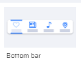
| Bottom bar Thumbnail | Bottom bar on Canvas | Bottom bar Properties | Bottom bar Item Properties |
|---|---|---|---|
 |  |  |  |
2) LIST VIEW
List View component shows a list of data in a vertically scrolling list. It consists of a List Header and a List item component. By default, the list header consists of the Text as the child component and the list item consists of the Grid and Text as child components.
Each element in the header and the list item can be independently edited and assigned properties. The child components can be added and removed as per requirements.
Additionally, they also have the Data property to dynamically populate the contents of the List View at run-time.
The Panel component, by default, has a List View in it.
| List View Thumbnail | List View on Canvas |
|---|---|
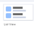 | 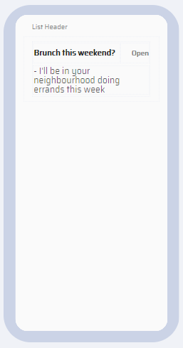 |
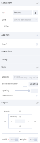
PROPERTIES:
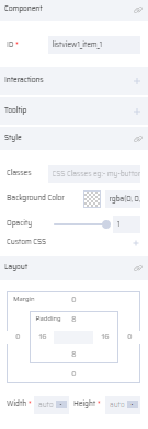
List View: ID( Add Variable ), Data (Link To Data Source), Filter, Add Item (to add a List item), Interactions, Tooltip, Style, Layout
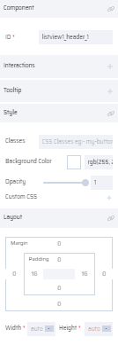
List Header: ID, Interactions, Tooltip, Style, Layout
List Item: ID, Interactions, Tooltip, Style, Layout
| List View | List Header | List Item |
|---|---|---|
 |  |  |
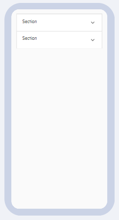
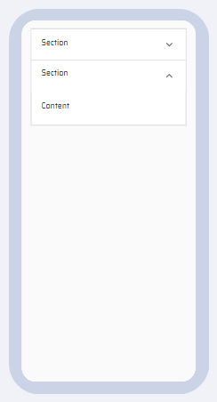
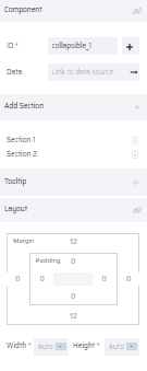
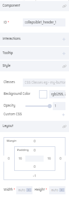
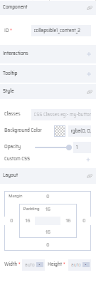
3) COLLAPSIBLE
It performs the Show/Hide function of data pertaining to a particular category or section. By default, there are two collapsible sections. More tabs can be added using the Add Section property. The text of both sections and its content can be edited.
Any components other than the Topbar, Bottombar, Navbar, and Panel can be added within the Collapsible component.
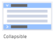
| Collapsible Thumbnail | Collapsible with content hidden | Collapsible with the content shown |
|---|---|---|
 |  |  |
PROPERTIES:
Collapsible: ID ( Add Variable ), Data( Link To Data Source), Add Section, Tooltip , Layout
Collapsible Header Section: ID, Interactions, Tooltip, Style, Layout
Collapsible Content: ID, Interactions, Tooltip, Style, Layout
| Collapsible | Collapsible Header | Collapsible Content |
|---|---|---|
 |  |  |
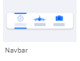
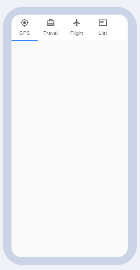
4) NAVBAR
Navbar helps the user to navigate to different screens by clicking the navbar tabs. By default, it consists of 4 tabs that function as buttons. The Navbar can only be placed at the top of the page. It is the counterpart of the bottombar and has the same properties as the Button component.
The Navbar is the parent component and Navbar items are the child components. Their properties can be edited individually. There is an Add Item property where new navbar items can be added as required.
PROPERTIES:
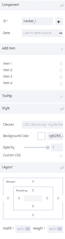
Navbar: ID ( Add Variable ), Data (Link To Data Source), Add Item, Tooltip, Style, Layout
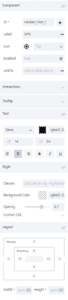
Navbar Item: ID ( Add Variable ), Label, Icon Picker, Position Select, Enabled, LinkTo, Interactions, Tooltip, Style, Layout
| Navbar Thumbnail | Navbar on Canvas | Navbar Properties | Navbar Item Properties |
|---|---|---|---|
 |  |  |  |
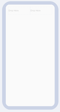
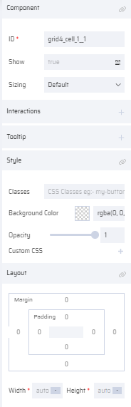
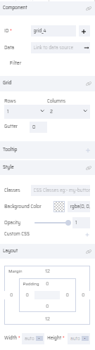
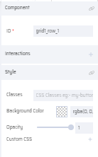
5) GRID
The Grid is a very dynamic component that adapts to screen size and orientation. It can be used within other components. It helps to dissect the page or another component/elements into one or more sections using the row/column property. The Gutter property determines the pixel gaps between the grid cells. Components can be dragged and dropped inside each grid cell. The size of the grid cell can be set in the sizing properties or can be customized using Custom CSS. Currently, a maximum of 5 rows and 12 columns can be added to a grid.
PROPERTIES:
Grid: ID ( Add Variable ), Data (Link To Data Source), Filter, Interactions, Grid (Rows, Columns, Gutter), Tooltip, Style, Layout
Grid Cell: ID, Show, Sizing (Default, 1-12), Interactions, Tooltip, Style, Layout
Grid Row: ID, Interactions, Style
| Grid Thumbnail | Grid on Canvas | Grid Cell Properties | Grid Properties | Grid Row Properties |
|---|---|---|---|---|
 |  |  |  |  |
6) TABLE
A Table component consists of a Key-value pair that can be added to a page. Once dragged and dropped, it consists of data in the form of a header and label. Additional columns can be added as per requirement.
The header and the label has properties that can be independently edited. The text of the header and label can be edited using the Text properties .
| Table Thumbnail | Table on Canvas |
|---|---|
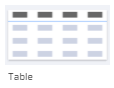 | 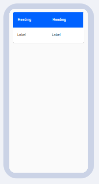 |
PROPERTIES:
Table: ID ( Add Variable ), Data (Link To Data Source), Filter, Add Column, Interactions, Tooltip, Layout
Table-Cell: ID, Interactions, Tooltip, Layout, Style, Layout
| Table | T- Cell Properties |
|---|---|
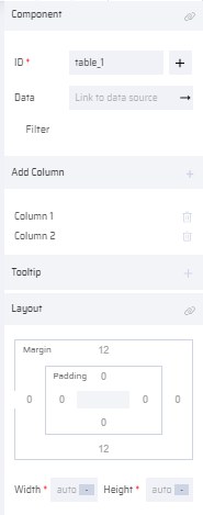 | 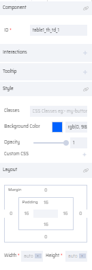 |
7) DATAGRID
A Datagrid component is used when the user needs to access a large dataset from the EdgeReady database or a table variable. By default, it has 1 row and 4 columns. Additional columns can be added through the Columns property.
The Datagrid Header properties for each header cell can also be defined. The Data can be linked to a specific column variable. The Sorting, Editable and Resizable properties for each header can be defined. If sorting is enabled, it is indicated by UP/DOWN arrow near the column header.
The Pagination property is used to set the no of rows that can be visible in the datagrid.
The user can add other components (excluding the Topbar, Footer, Panel and Navbar) within the Datagrid. The child component properties apply correspondingly.
Refer How to use Selected property in the Datagrid Component for more information.
| DataGrid Thumbnail | DataGrid Canvas |
|---|---|
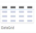 | 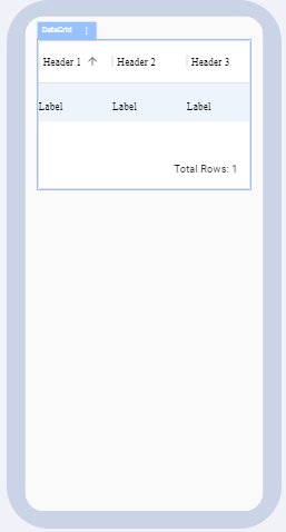 |
PROPERTIES:
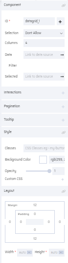
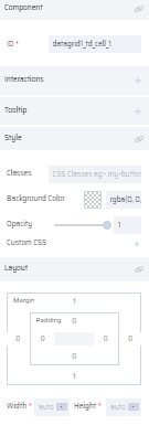
DataGrid: ID ( Add Variable ), Selection, Columns, Data, Filter, Selected, Pagination, Interactions, Tooltip, Style, and Layout
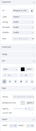
DataGrid Header: ID ( Add Variable ), Label, Sorting, Resizable, Editable, Data, Interactions, Tooltip, Text, Style, and Layout
DataGrid Cell: ID, Interactions, Tooltip, Style, and Layout
| DataGrid | DataGrid Header | DataGrid Cell |
|---|---|---|
 |  |  |
- In the UI, when the end user clicks the ellipses menu of the Datagrid columns, each column by default displays the Filter, Hide, and Show options.
- The Filter enables the user to filter columns with an AND/OR condition as well as the different Operators that change based on column data.
- More filters can be added by clicking +ADD FILTER.
- When multiple filters are added, all filters must hold either an AND condition or OR condition but not a mix of both.
8) DIALOG BOX
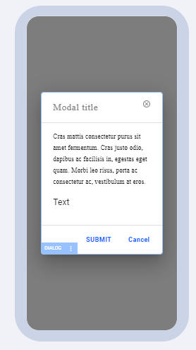
A Dialog box is a popup window on the app screen to display any 'confirmation messages' or to enter any user values. It consists of a Title, content, and default 'Submit' and 'Cancel' buttons. The user can add additional components within the content and footer sections of the Dialog box except the Topbar, Bottombar, Navbar, Panel and Dialog.
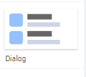
| Dialog Box Thumbnail | Dialog Box on Canvas |
|---|---|
 |  |
PROPERTIES:
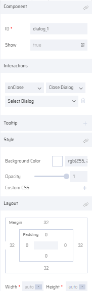
Dialog: ID, Show, Interactions, Tooltip, Style, Layout
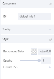
Dialog Title: ID, Tooltip, Style
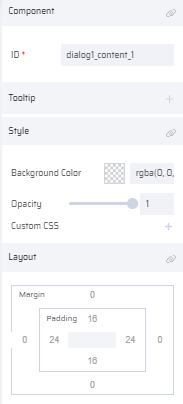
Dialog Content: ID, Tooltip, Style, Layout
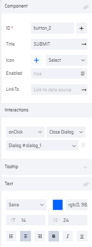
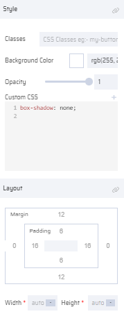
Dialog button: ID, Title, Icon, Enabled, Link To, Interactions, Tooltip, Text, Style, Layout
| Dialog | Dialog Title | Dialog Content | Dialog button |
|---|---|---|---|
 |  | 
|   |
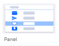
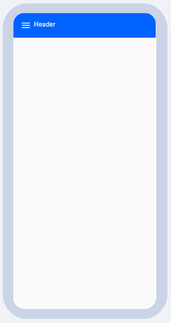
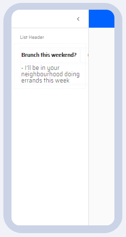
9) PANEL
The panel consists of options that cascade in and out of the screen when the 3 lines menu icon on the Header is selected. They are used to Show/Hide several list items. The panel positions can be modified to appear on the left/right side of the screen.
By default, a panel component consists of 3 list items. More list items can be added and their properties can be changed individually. All List View Properties apply to the list item inside the panel.
| Panel Thumbnail | Panel on Canvas - Hidden list item | Panel on canvas - List Item shown | Panel Properties |
|---|---|---|---|
 |  |  | 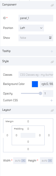 |
PROPERTIES:
Panel: ID, Position, Show, Add Item, Tooltip, Style, and Layout
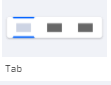
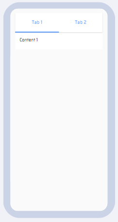
10) TAB
It consists of two tabs in the form of buttons and a content section under it. The two tabs function similar to buttons. Any components other than the Topbar, Bottombar, Navbar, and Panel can be added inside the content section.
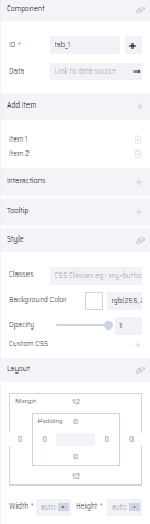
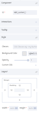
| Tab Thumbnail | Tab on Canvas | Tab Properties | Tab Content Properties |
|---|---|---|---|
 |  |  |  |
PROPERTIES:
Tab: ID( Add Variable ), Add Item, Data (Link To Data Source), Interactions, Tooltip, Style, and Layout
Tab Content: ID, Interactions, Tooltip, Style, and Layout
The Tab functions are similar to buttons and all button properties apply to each Tab in the Tab component.
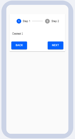
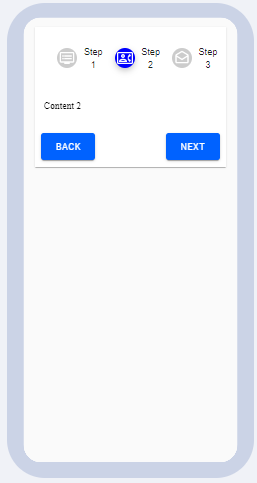
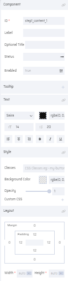
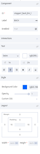
11) STEPPER
The Stepper component is used when the user needs to fill multiple pages in a sequence. You can set validations within each page that enables the user to move to the next page only when the current page is completed. The Stepper Type property enables the user to number the steps or add a custom image for each step. For numbered stepper, the step icon position is set in the Label Position property. The Status of each page can be set as required. If the user has filled the right information, the page can be marked with 'Completed' status. Else, it is denoted by an 'Error' status.
By default, the Stepper component holds the item, button and text components as child components within it. The respective child component properties apply to it as well. You can edit the parent and child component properties as required. Other components excluding the Topbar, Bottom bar, Panel, Navbar can be added within the stepper.
The user can add any no of steps as required for the use case. In the UI during runtime, by default the BACK button is disabled for Step 1 and a FINISH button is displayed for the final step.
| Stepper Thumbnail | Stepper on Canvas (Numbered Steps) | Stepper on Canvas (Steps with Custom image) |
|---|---|---|
 |  |  |
PROPERTIES:
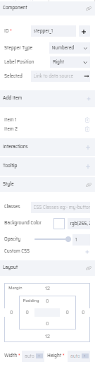
Stepper: ID ( Add Variable ), Stepper Type, Label Position, Selected, Add Item, Interactions, Tooltip, Style, and Layout
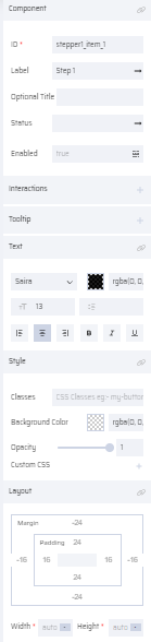
Stepper Item: ID, Label, Optional Title, Status, Enabled, Interactions, Tooltip, Text, Style, and Layout
Stepper Content: ID, Label, Optional Title, Status, Enabled, Tooltip, Text, Style, and Layout
Stepper Button: ID, Label, Enabled , Interactions, Text, Style, and Layout
| Stepper | Stepper Item | Stepper Content | Stepper Button |
|---|---|---|---|
 |  |  |  |